Data & Analytics Dashboards

Data gains value not where it's collected, but where it's shown
Management panels & dashboards
Scattered data — sales, stock, collections, faults — tells no story until it's gathered on one screen. Management panels, with role-visible widgets, sum up the state of the business at a glance; the user doesn't 'run' a report, they open the dashboard.
- Role-visible widgets
- The business's current state at a glance
- Dashboard experience distilled from our product family
Filterable reporting & export engine
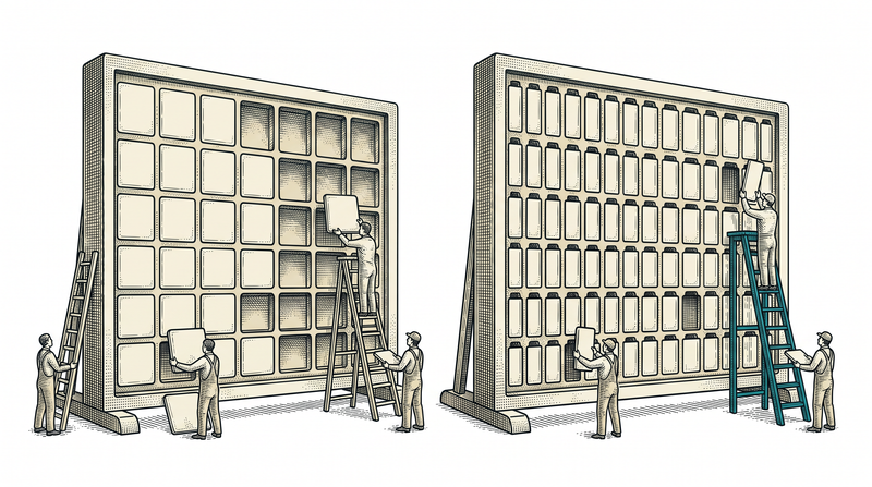
The detail a dashboard doesn't show lives in the report: filtered by date range, branch, product or customer; the result exports to Excel, PDF or CSV. Once a scheduled report is set up, the right person finds it in their morning inbox without pressing a single button.
- Multi-dimensional filters: date, branch, product, customer
- Excel/PDF/CSV export
- Scheduled reports and email summaries
Large data grids & pivot tables
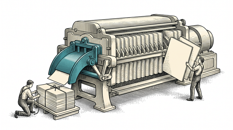
Scanning a list of thousands of rows isn't a job for a human; with sorting, grouping and pivoting, the data reorganizes itself. Trends and comparisons are computed with aggregation and window functions, without the page freezing.
- Sorting, grouping and pivoting
- Aggregation and window functions
- No-freeze performance on large datasets
The scope beneath the dashboard
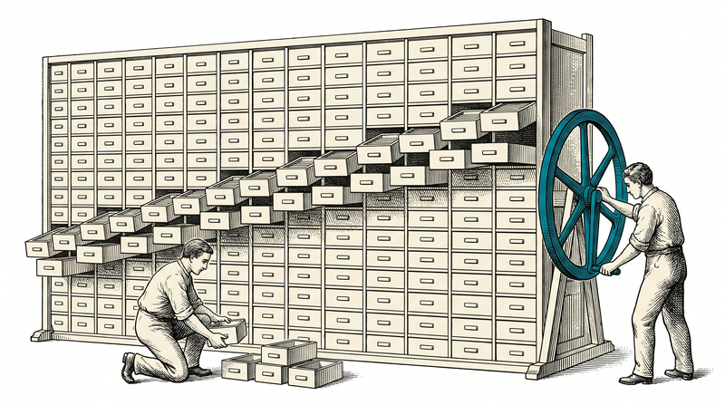
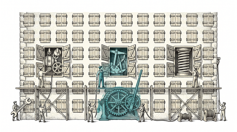
A management dashboard isn't a single screen; it's a chain from data collection to decision.
Management panels & dashboards
Panels that summarize the business's current state on one screen with role-based widgets.
Filterable, exportable reports
Reports filtered by date, branch, product or customer, exporting to Excel/PDF/CSV.
KPI & statistics strips
Strips that keep the business's few most critical numbers always visible and surface deviation at once.
Decision support & trend analysis
Analysis that benchmarks against last month, last year or a comparable unit, turning deviation into an alert.
Large data grids & pivot tables
A table layer that sorts, groups and pivots thousands of rows without freezing.
Scheduled reports & email summaries
Automatic report delivery that reaches the right person on a regular schedule, without a click.
How we build an analytics dashboard
Data model & source map
We map where each piece of data comes from and which decision it serves; sources are unified into one model.
Query & aggregation design
We build performant queries with aggregation and window functions, keeping response fast even on large datasets.
Dashboard & report development
We build the role-based dashboard, the filterable report and the KPI strip, and validate them with real data.
Scheduled delivery & monitoring
We set up automatic report delivery, monitor dashboard performance, and continue under SLA maintenance after launch.
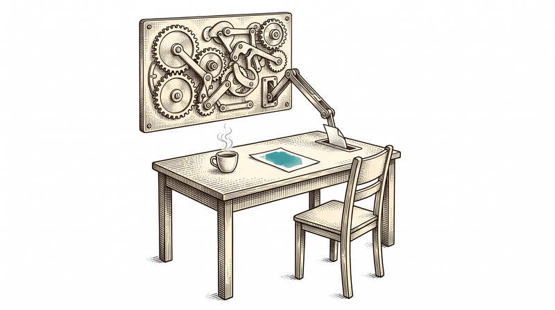
Behind a management dashboard is a decision, not raw data
A number alone rarely means much; its meaning comes from comparison. Did it rise from last month, fall short of a comparable branch, drift from what was planned? Our dashboards make that comparison automatically — the manager doesn't guess where the problem is, they see it on the dashboard. This is a habit we've built again and again across our products; every product has its own grid, its own filter and its own reporting layer, but the kitchen is the same.
Visualization is a means, not an end. What matters isn't a chart looking pretty, but answering the right question at the right time — which is why we start every dashboard design by asking 'what decision will the person opening this screen make.'
- Comparison is automatic, no guessing needed
- One shared dashboard/report kitchen
- Every design starts with 'which decision gets made'
- Visualization is a tool, not the goal
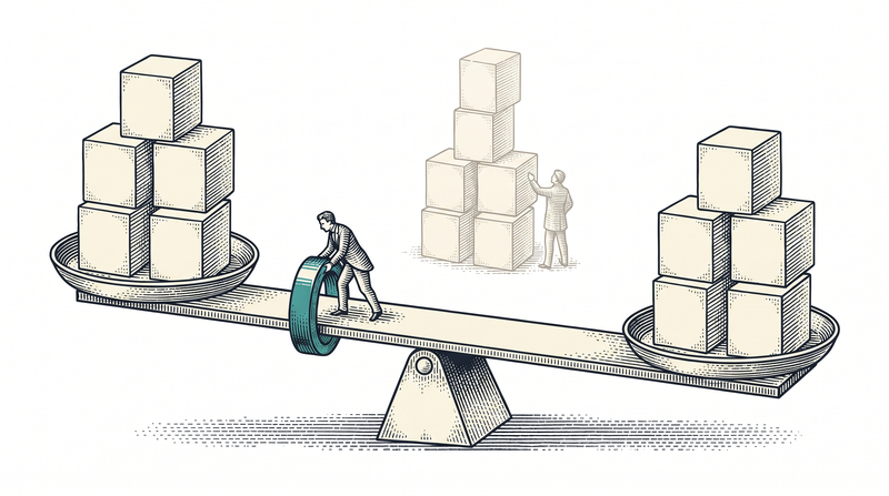
Where our dashboards leave a sector trail
The same grid, filter and reporting kitchen answers a different question in each sector.
Energy & facility
Consumption is tracked by building/floor/device, benchmarked against last month and a comparable building; deviation becomes an alarm.
Finance & insurance
Revenue, refunds and pending collections on one panel; line-level reconciliation with the provider's statement runs on the same screen.
Care & health
Floor, room and bed occupancy on one panel; new admissions, transfers and empty beds visible at once.
Public sector & field service
Open jobs are tracked on one panel; duration and completion rates are seen without phone traffic.
What ships as standard in every dashboard setup
The technology we build on
- Charts
- grids
- pivots
- .NET 9
- PostgreSQL
- Aggregation
- window functions
- Excel
- CSV
Let's turn your data into decisions
We'll listen to which decision you need to make on which screen and design your dashboard together. The first conversation is non-binding.
Frequently asked questions
Only ready-made products, or custom development too?
Both. Our products are used by subscription; if your need differs, the same team builds custom.
How does pricing work?
Monthly subscription for products; fixed price or monthly contract for custom projects. First call is free.
Do you sign NDAs?
Yes — we'll sign before the first call if you ask.
Can we work from abroad?
Yes, we're remote-first; communication in Turkish and English.
Will it integrate with our existing systems?
Integration is at the core of what we do: our solutions talk to existing ERP/CRM and hardware.