UI/UX Design
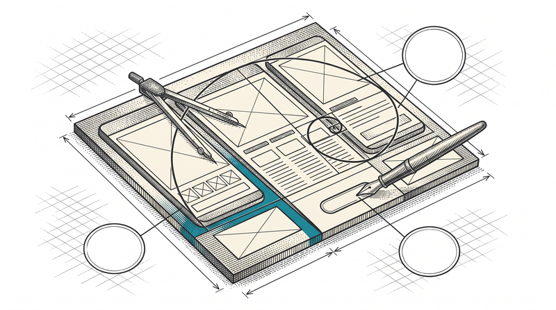
Design you don't see, speed you feel
Theme tokens, not eyeballed color
Color, spacing and typography are defined in central design tokens, not eyeballed screen by screen; light and dark theme derive from the same token set. This very site runs on that principle — the dark panel, button and accent color come from the same source on every page.
- One token set, two themes
- Consistency enforced at the code level
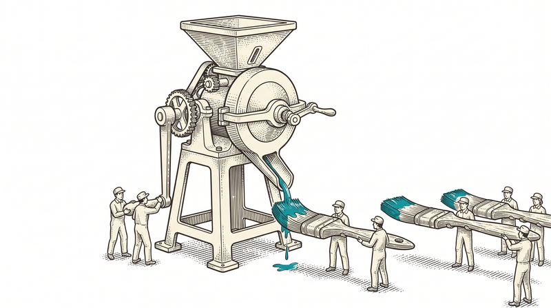
Multilinguality and RTL aren't bolted on later
An interface adapted after the fact to a right-to-left language like Arabic usually breaks. This very site publishes in four languages (tr/en/de/ar); in the Arabic version, layout, icon direction and reading flow were designed for RTL from the start.
- Published in 4 languages, RTL included
- Layout built for RTL from the start
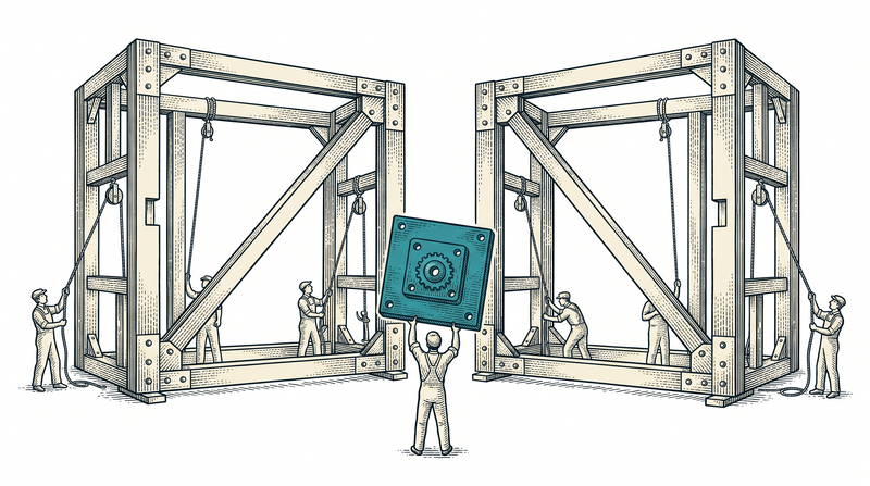
A component library, not repeated work
Repeating pieces like buttons, cards and form fields are designed once and turned into components; a new screen is assembled from that library. The panels of our sector products draw from the same component logic — no screen is drawn from scratch.
- A consistent component from design to code
- Shared logic across our product panels
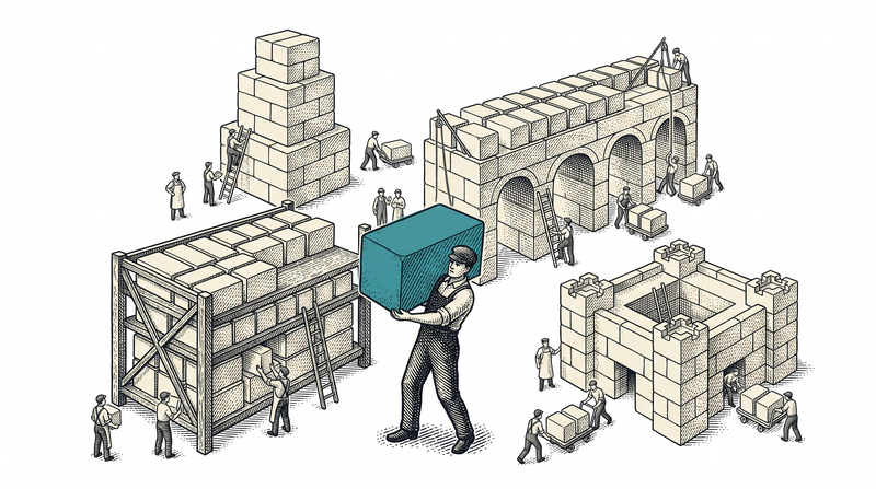
Good interface is speed, not decoration
If a screen a staff member taps a thousand times a day saves one second, the design has more than paid for itself. An interface where a customer can't figure out what to do in the first ten seconds makes even the most expensive feature invisible. At Vosetu, design isn't the layer left for last — it's the discipline that measures how fast a screen serves whoever is using it.
We say this not as a claim but through the tool we use: we design in Figma, test early with a clickable prototype, then reproduce the exact same result in code with Tailwind and design tokens. The gap between design and code is whether a screen reaches the user exactly as it left the designer's hands — we're the ones who close that gap.
- Design-to-code, one to one, from Figma
- Accessibility and RTL included from the start
- A shared component language across our product panels
- Measured speed, felt simplicity
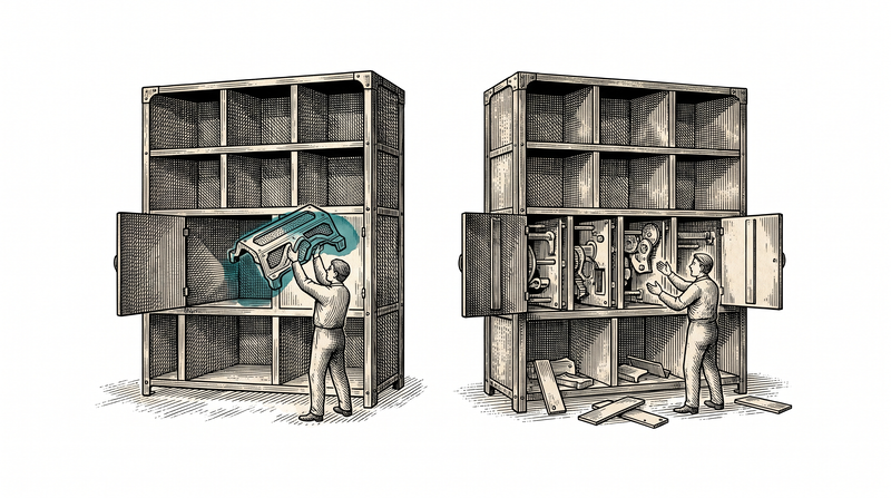
The sub-services living under design
A brand-new product and the refresh of an existing screen go through the same discipline.
Product interface design (web + mobile)
We design screens for web and mobile with a consistent visual language; platform differences are handled deliberately.
Prototyping & user flows
We test the flow early with real users through a clickable prototype, catching problems before coding starts.
Design systems & component libraries
We bind color, typography and components to tokens; a new screen is assembled from the library, not drawn from scratch.
UI refresh of an existing product
We modernize the interface of a working product without touching its business logic.
Accessibility & multilinguality (RTL included)
We build in keyboard access, contrast and readability; RTL languages such as Arabic are part of the design from the start.
User testing rounds
We test the design with real users and carry feedback into the next iteration.
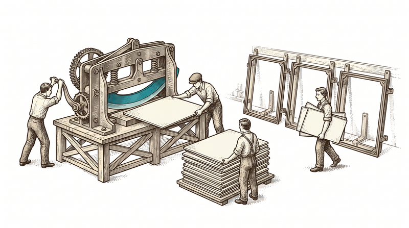
Where our design language is at work
The same tokens, components and accessibility principles work behind different products with the same discipline.
This site: vosetu.com
The public site you're browsing right now is a live example of the same design system, in 4 languages including RTL.
Admin panels
Admin panels built with Angular run at a different density than the public side, but in the same visual language.
our sector products
Panels across different sectors all draw from the same component library and token set.
How we design an interface
Discovery & flow mapping
We map what the user wants to do on screen and the friction in the current flow.
Wireframe & prototype
First the skeleton, then a clickable prototype; content and flow are tested early.
Visual design & design system
We produce the final visuals in Figma and register tokens and components into the design system.
Handoff to code & user testing
The design is reproduced one to one in code with Tailwind and tokens, then refined through testing with real users.
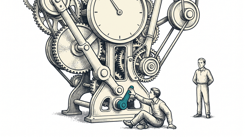
What ships as standard in every design project
The technology we build on
- Figma
- Tailwind
- design tokens
- Clickable prototypes
- User testing rounds
Let's speed up your interface together
We'll listen to your screens and your users and map out where to start, together. The first conversation is non-binding.
Frequently asked questions
Only ready-made products, or custom development too?
Both. Our products are used by subscription; if your need differs, the same team builds custom.
How does pricing work?
Monthly subscription for products; fixed price or monthly contract for custom projects. First call is free.
Do you sign NDAs?
Yes — we'll sign before the first call if you ask.
Can we work from abroad?
Yes, we're remote-first; communication in Turkish and English.
Will it integrate with our existing systems?
Integration is at the core of what we do: our solutions talk to existing ERP/CRM and hardware.